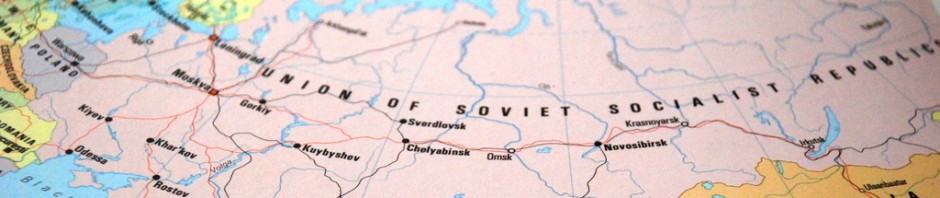
 As we are now onthe brink of writing our first fully synoptic essays on the peasants I think it would be helpful to return to our agriculture timelines.
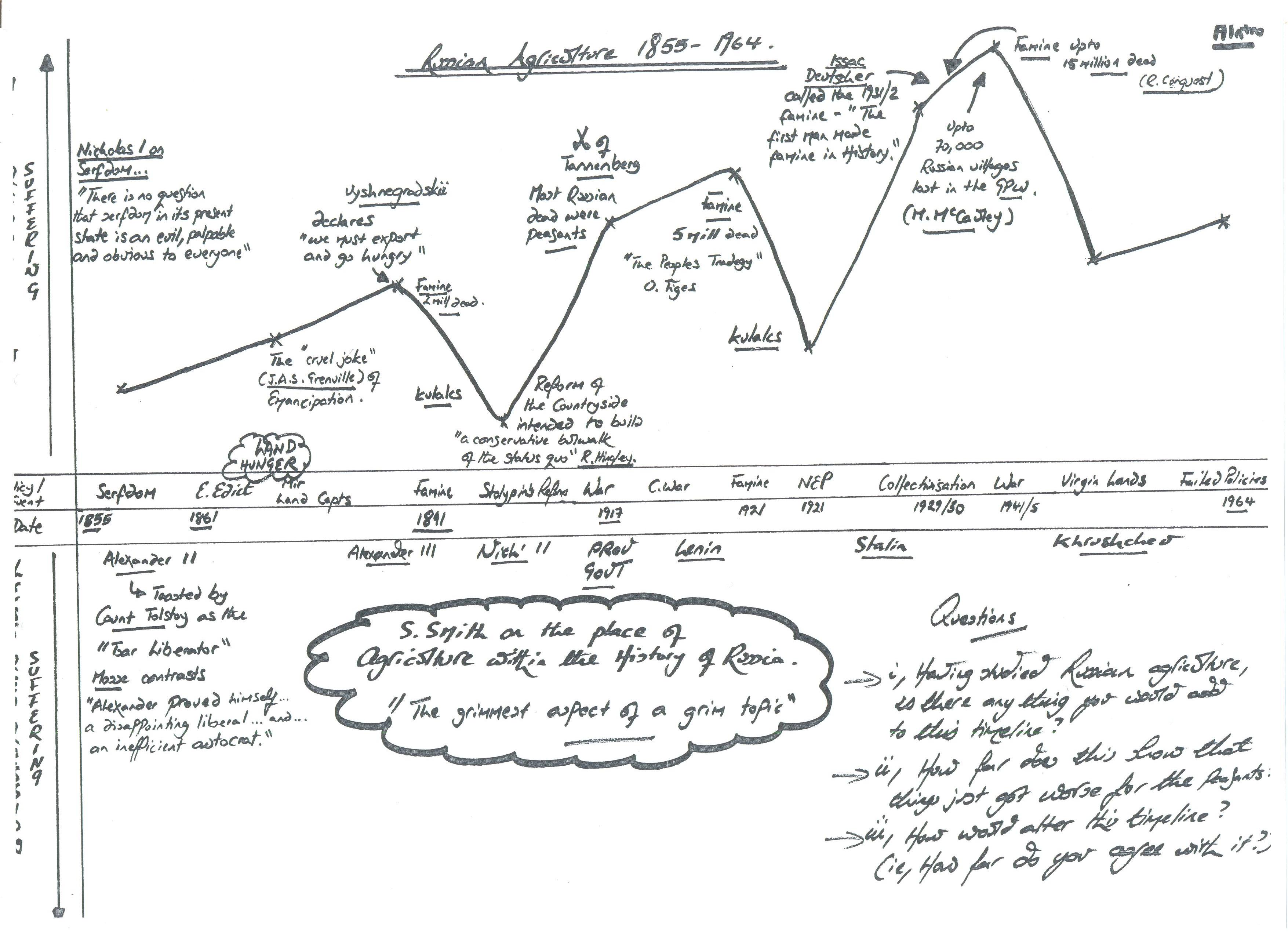
Task :- Have a look again at the timeline. Now that you understand this theme what do you think of it ? In pairs discuss it and post a comment below thinking carefully about the relative positions of the key events. Make sure that you explain your reasons behind your comments.
Mr Kydd.

I think that the diagram is indeed very accurate.
From the trend of the suffering, things get worse as time goes on. This is very strange given that one would expect a country such as Russia to be able to modernize as times goes on, not to allow the suffering to increase and for famines to claim more victims each time they strike.
But ultimately it was largely the fault of various government officials ie. Vyshnegrasky & Grain Requisitioning, Lenin & War Communism, Stalin & Collectivization. One must wonder that if they had acted differently and considered the retaliation and reaction of the peasantry, would these tragedies have continued and worsened?
One point that I slightly disagree with is the positioning of Vyshnegradsky’s famine, I would have probably placed it a little higher on the graph, given the monumental affect it had. He sought industrialization but only obtained suffering, his dreams had to be put on hold, not only were the peasantry dying of starvation, they were being robbed of their grain. It is worsened by the fact that this famine was the first to strike after the emancipation edict; Grenville is perfectly justified when he references the emancipation as a “cruel joke” given what is soon to come for the peasantry.
It is hard to argue with the general pattern of an increasing extent of suffering for the peasantry shown above. From the repression of serfdom, where up to 1914 50 percent of their children died before they were five, to the death of 27 million peasants under Communist rule in the period 1917 to 1956, somehow life manages to get continually worse for the peasantry.
However, the success of Stolypin’s reforms does appear to be exaggerated, which did not reduce suffering for the majority of peasants, only the Kulaks. Peasant poverty continued and tensions remained, as proved by renewed peasant riots in 1917.
I strongly agree with the general trend of the diagram: that the extent of suffering increased quite considerably over time.
You could arguably place place Stolypin’s Reforms just slightly higher, as although they did remove the burden of redemption payments, they didn’t significantly benefit most peasants. Also, you could place serfdom a bit higher because even though the suffering was nothing like that experienced in the famines of 1921 and 1931-2, life before Emancipation was far from comfortable for the peasants and it’s easy to underestimate how bad serfdom was as an economic as well as social, political system.
This said, when you isolate Stolypin’s Reforms for example, they seem a lot worse (and therefore should be higher on the graph). When you consider the whole period, however, from Serfdom to War Communism to collectivisation to Khrushchev’s Virgin Lands policy, the events are in more or less the right place when you compare the extent of suffering
I think that for the most part, the diagram is an accurate representation of suffering, as things did get worse for the Russian peasant over the 109 years with only brief periods of reform.
However I would move the reforms of the NEP a little further down on the graph as it was one of the few periods in our course when the needs of the peasantry were actually considered. Grain requisitioning was abolished, and peasants were encouraged to be more efficient as they could now sell any surplus and would pay less tax if they increased their grain production. Edward Acton describes this as the ‘golden age of the Russian peasantry’ and I agree. However I wouldn’t place it at the same level as Stolypin’s reforms because they ended Redemption Payments which were the greatest barrier to improving the lives of Russian peasants.
I agree with the general positioning of each event in relation to each another and the trend of increasing suffering towards the end of the course.
However, I would put Stolypin’s reforms slightly higher. This is because, despite the major relief of abolishing redemption payments, his reforms changed little else for the majority of peasants. His reforms were also incomplete and the effect that they had for the peasantry is hard to judge and quantify as they were quickly forgotten with the start of the War. This means that although they did improve living standards and should be lower down on the graph, their position is perhaps exaggerated by the removal of the redemption payments. They were also insincere reforms, for the purpose of helping Russia’s economy and stabilising Tsarist rule, which may have meant that these reforms were only ever intended to be short term, which would support them needing to be higher on the graph. Overall, it can be argued that this period of reform was too short to be able to justifiably place them so low on the scale of suffering as many major problems were still present. I do, on the other hand, believe that it is correct to position these reforms lower than the other events in our course.
The only slight change I would make to the timeline is that the suffering of the peasantry during the second world war was greater then how it is currently positioned. As this was a period where R. Conquest estimates a staggering 15 million die due to famine and families and villages are completely wiped out. This is clearly the highest point of suffering for the peasantry in our course and its current placement on the graph does not display how drastic the suffering was.
I largely agree with the general positioning of the graph in regards to the fact that as time progressed, there is a direct correlation to the level of suffering. However, I would personally alter the positioning of various points .
Primarily, I feel that the first three points should be places slightly higher, especially serfdom itself and the Emancipation Edict. This is because it’s noteworthy not to underestimate the scale and amount of suffering that Serfdom brought, with serfs having no freedom of movement, no payment, no choice of marriage and low life expectancy. Additionally the severity of impact the Emancipation, especially with redemption payments which could last up to 49years, resulted in the peasantry paying back far more than the insignificant land they ‘owned’ was worth.
Following this, I believe that the positioning of Stolypin’s reforms is exaggerated, and should be places slightly higher. Although the abolishment of redemption payments was a huge relief on the peasantry, his reforms were incomplete and mainly beneficial to the richer peasants.
Lastly, I feel the point of suffering during the second world war should be higher as although it is correct overall as being the largest point of suffering, the scale of this suffering should again not be underestimated, with Traynor estimating a staggering 22million Soviet Deaths.
I also agree with the suggestion that Stolypin’s reforms should be placed higher on the graph as, though it abolished the redemption payments, it was only the Kulaks that profited significantly.
Furthermore, despite the archaic semblance between it and the NEP, I think that the NEP should show a more significant lessening of suffering, but as it is, remain higher than Stolypin’s reforms, as the overall suffering of the period, particularly due to War Communism was considerably worse.
In addition, the wanton actions of Stalin in the area of Collectivisation appear quite understated considering the incomparable prediction of death rates to the prior events such as Vyshnegradski and War Communism, so I also think they should be higher on the graph.
This is rubbish. This is academic nonsense. Niall Ferguson could do better.